Electrik Eel Festival
Brand Identity & Responsive Web Design
The Challenge
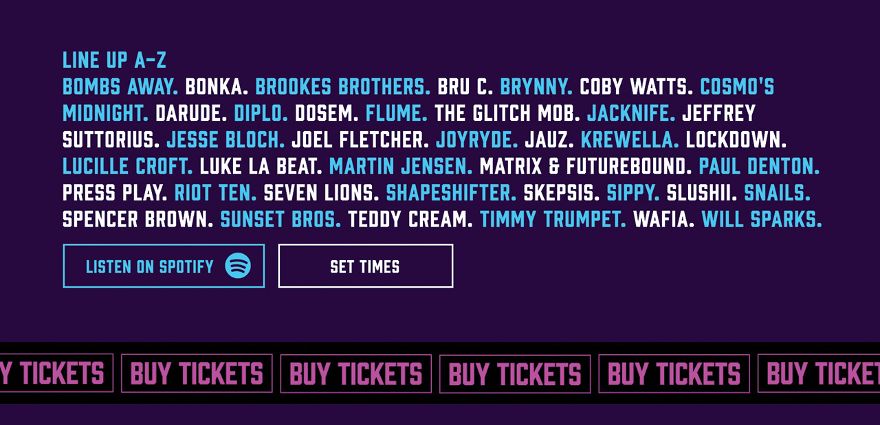
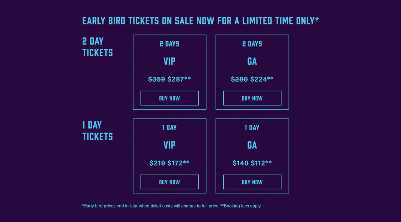
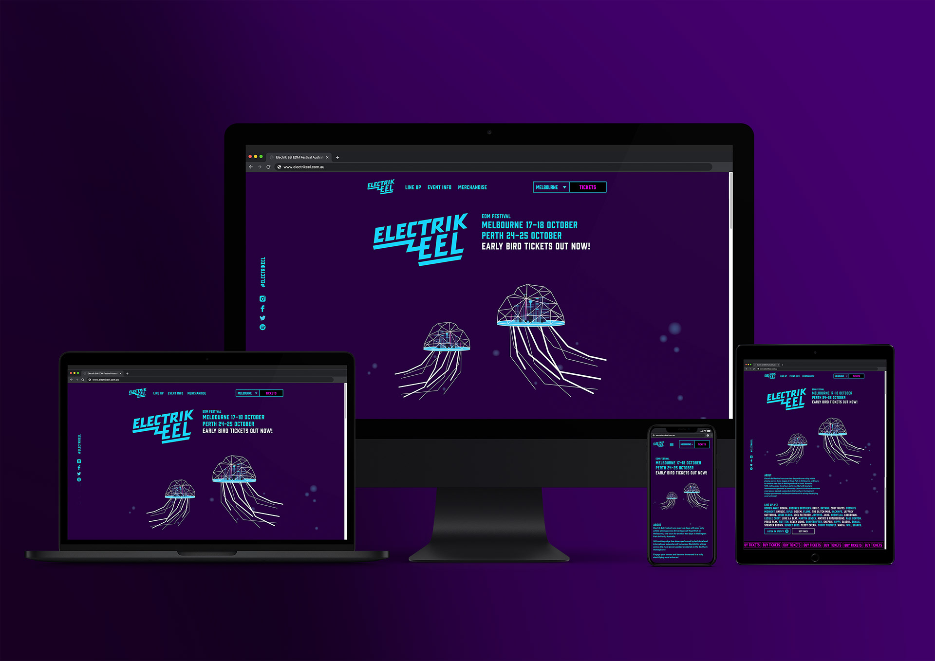
The challenge was to develop distinct visual branding for the fictional Electrik Eel electronic dance music (EDM) festival, and design and code a responsive website for it's debut season across two weekends in Melbourne and Perth. The brief requested a futuristic, digital and underground tone of voice, and emphasized that ticket sales were their greatest priority.
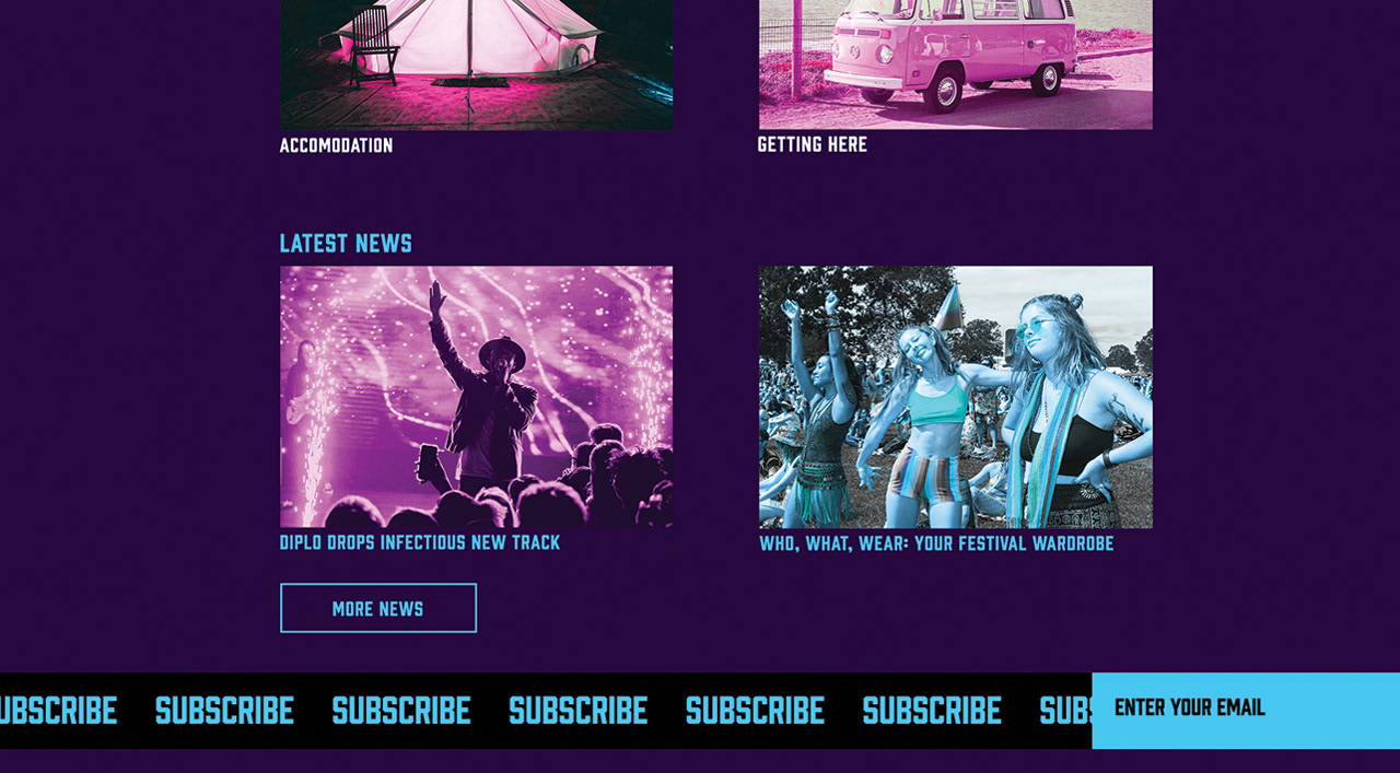
I profiled users and conducted user experience tests on a competitor's website to gain insight into user behaviours and preferences. This revealed that multi-day festival websites convey a staggering amount of information and must enable efficient communication of relevant information to different users in a delightful manner, whilst avoiding information overload.
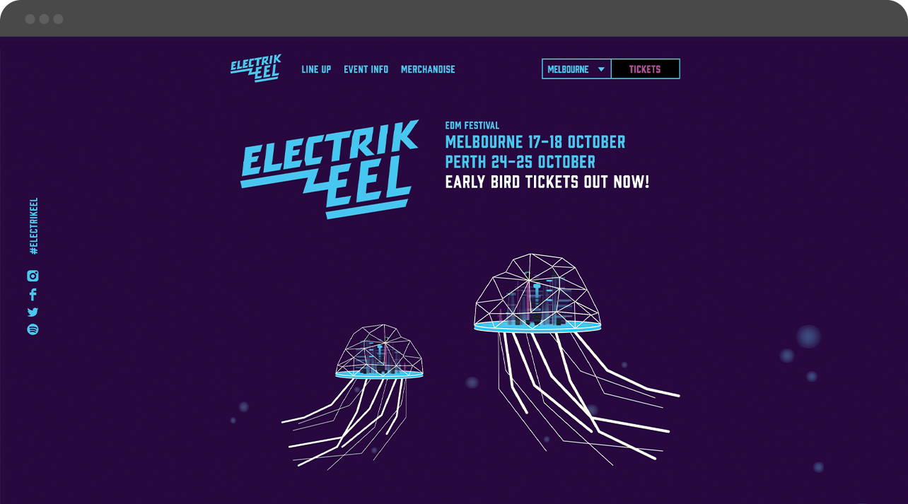
The Solution
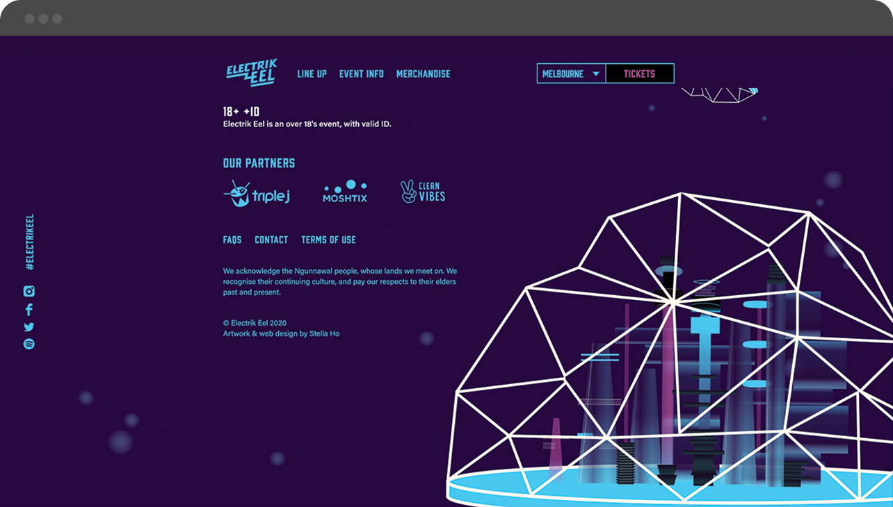
To generate an other-worldly atmosphere I crafted a "Neo-Atlantis" theme, and illustrated a futuristic, mythical, neon city, glowing beneath electronic jellyfish domes. The colour palette was inspired by 80s neons and sci-fi cyberpunk artwork.
The hand-drawn logo was inspired by 80s digital typography and neon signage, and adds to the futuristic atmosphere. The extended arm of the 'E' suggests a lightning bolt or wriggling eel.
